Close

Ready to start our journey together?
We’re not for everyone, but if you’re ready to build something great, let’s connect.
Oops! Something went wrong while submitting the form.
We’re not for everyone, but if you’re ready to build something great, let’s connect.
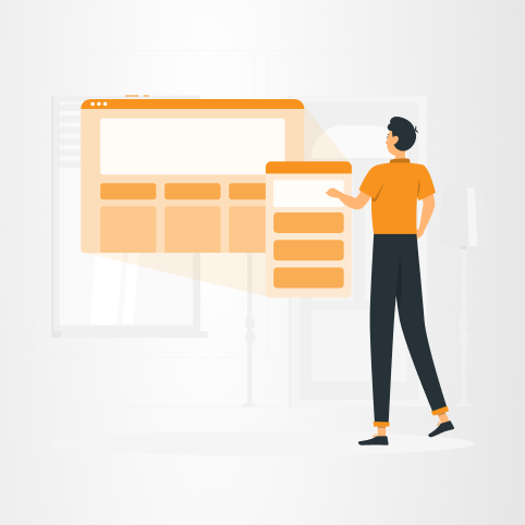
Mobile-first isn’t enough anymore. Discover why seamless multi-device experiences are key to engagement and user satisfaction.

Mobile-first design has been the standard for over a decade. As smartphones became the dominant way people access digital services, designing for smaller screens first made perfect sense. Today, however, user behavior has evolved. People no longer interact with products on a single device- they move seamlessly between phones, laptops, tablets, and even wearables throughout the day. This shift means that mobile-first alone is no longer enough. What matters now is multi-device thinking.
Modern user journeys are no longer linear. A user might discover a product on a phone, continue exploring it on a laptop, and complete an action later on a tablet. Research shows that users regularly interact across multiple channels and devices before making decisions, creating journeys that are fragmented rather than step-by-step . This behavior challenges traditional design approaches that focus primarily on optimizing one device instead of the entire experience.
The limitation of mobile-first design is not that it is wrong, but that it is incomplete. Optimizing for a single device- even the most dominant one- can create inconsistencies across platforms. Interfaces may function well on mobile but feel disconnected or inefficient on desktop. Features that are simplified for smaller screens can lack depth when accessed on larger ones. As a result, users experience friction when switching between devices, which can negatively impact engagement and retention.
Consistency across devices is therefore critical. Users expect the same functionality, clarity, and continuity regardless of where they start or finish their journey. This includes synced data, consistent navigation logic, and recognizable design patterns. When these elements are missing, the experience feels fragmented. In contrast, products that provide smooth transitions between devices create a sense of reliability and trust.
Performance also plays a major role. Different devices come with different expectations- mobile users prioritize speed and simplicity, while desktop users often expect more complex functionality. Meeting these expectations requires a flexible approach to design and development. It is not just about resizing layouts; it is about adapting the experience to the context in which it is used.
Another important factor is personalization. As users move between devices, they expect the system to remember their preferences, history, and actions. This requires a strong backend architecture that supports real-time synchronization and secure data handling. Without it, even the best-designed interface can feel disconnected.
For businesses, the impact of multi-device experience is significant. A fragmented journey can lead to drop-offs, abandoned actions, and lost opportunities. On the other hand, a seamless experience improves conversion rates, strengthens user loyalty, and increases overall satisfaction. Companies that understand and design for this behavior gain a clear competitive advantage.
At Lynx Solutions, we approach product design with this ecosystem mindset. Instead of focusing on individual screens, we design connected experiences that move with the user. By aligning UX, development, and architecture, we ensure that products remain consistent, adaptable, and intuitive across all devices. The goal is not just to meet users where they are, but to follow them wherever they go.
Mobile-first was an important step forward, but it is no longer the finish line. Designing for today means designing for continuity- across devices, contexts, and moments. The future of digital experience is not tied to a single screen, but to the seamless connections between them.


